
Stellaire Branding
Stellaire is a speculative brand identity project inspired by a sleek, futuristic faucet design. The process began with naming and brand positioning, followed by the creation of a logo, tagline, packaging, and a launch poster. The goal was to translate the product’s form and feel into a brand that speaks elegance, innovation, and modern utility.
Process
Background Intent
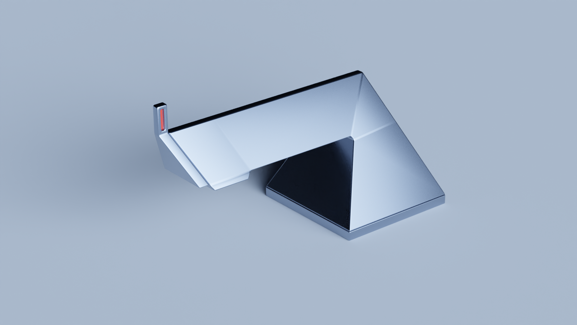
The Stellaire branding project began with a single product: a faucet. But not just any faucet—this one had a striking, futuristic form that instantly stood out. At first glance, it felt like a fusion between a pyramid, the Louvre glass structure, and something almost alien—like a weapon from a sci-fi universe. It was sleek, minimal, and somehow ominous.
Our challenge was to build a brand identity from this form alone. The project was speculative in nature, meaning there was no real product brief—just the form as the foundation. The task was to extract meaning, create a narrative, and then build a complete visual identity system from that.
Form Analysis & Conceptual Theme
We began by studying the physical and emotional characteristics of the faucet. It was:
- Angular and faceted, like a prism or crystal
- Dominating and directional in its stance
- Shiny, cold, and industrial in materiality
- Abstract enough to feel like an object of mystery
We listed all the associations this triggered: pyramids, space probes, alien structures, futuristic buildings, sci-fi portals. We couldn’t decide on just one direction, so we combined them into a theme that felt rich and layered:
➡️ Space Prism — a fusion of cosmic mystique and geometric precision.
This became the core concept around which the brand would be built. The idea was to take the faucet out of the kitchen or bathroom context and instead reframe it as a luxury object born from future tech and interstellar design.
Naming & Strategy
With the theme in place, we began exploring names. We wanted something:
- Futuristic, but elegant
- Suggestive of light, reflection, or stars
- Easy to remember and say
After many iterations, we chose the name Stellaire.
- It’s derived from “stellar” (relating to stars) and “aire” (a French suffix suggesting elegance or essence).
- It evokes a premium, global, and slightly French-luxury feel—perfect for a high-end faucet brand.
From there, we built a brand strategy:
- Positioning: Futuristic luxury faucet brand for design-forward homes and hotels
- Tone of voice: Minimal, refined, poetic, and slightly mysterious
- Brand values: Innovation, elegance, geometry, purity
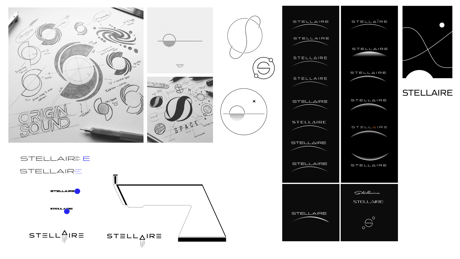
Logo & Tagline Development
The logo was inspired by the faucet’s angular geometry. We avoided any literal water imagery and instead used sharp, crystalline lines to convey form and structure. The typography was kept clean and spaced, allowing it to feel airy and high-end.
The tagline was created to anchor the theme of mystery and innovation. Some directions we explored included:
- Form. Flow. Future.
- Elegance Engineered.
- Where Geometry Meets Utility.
- Designed Beyond Earth.
We eventually settled on a line that reflects both minimalism and aspiration, fitting the "Space Prism" brand tone.
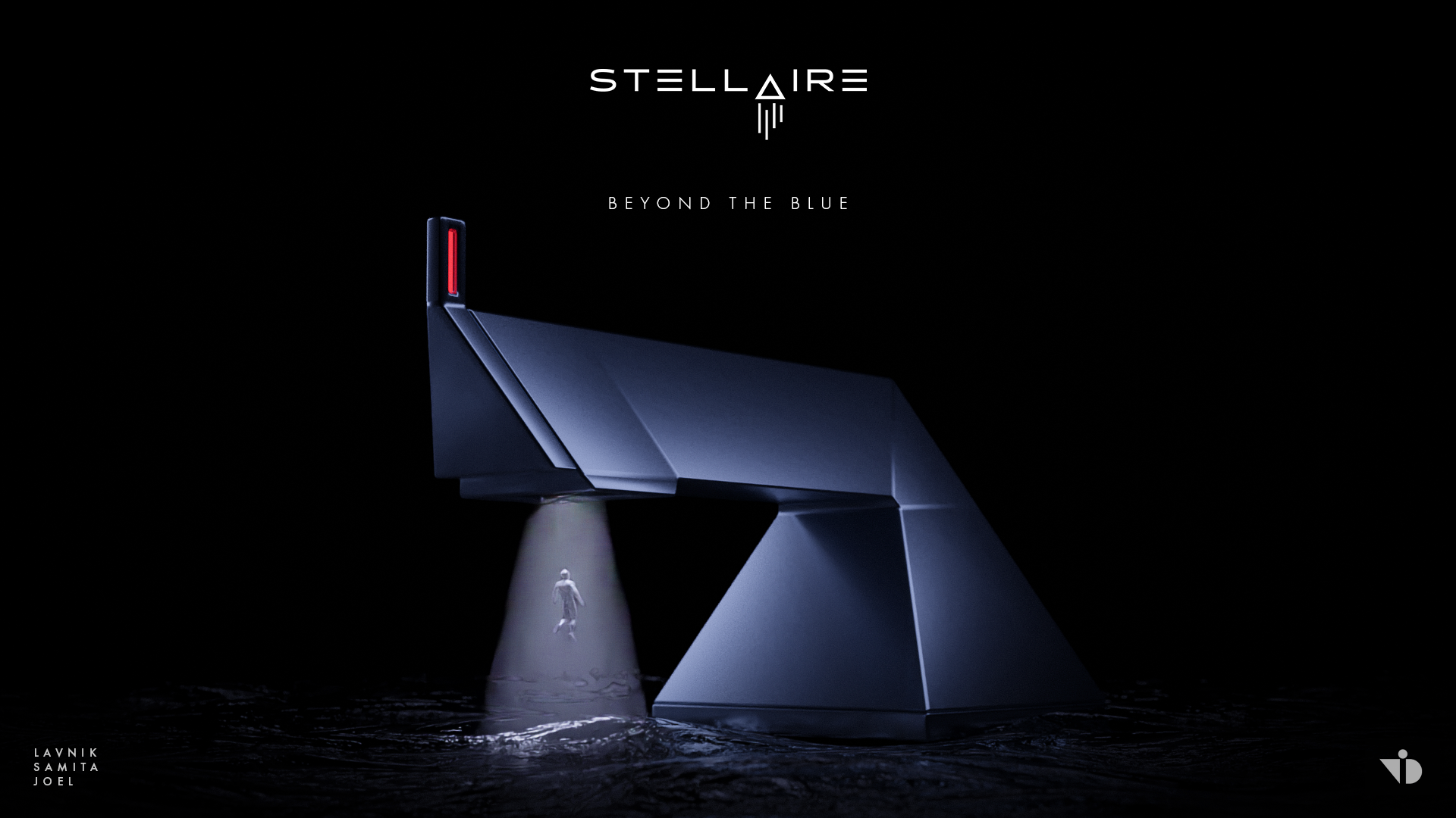
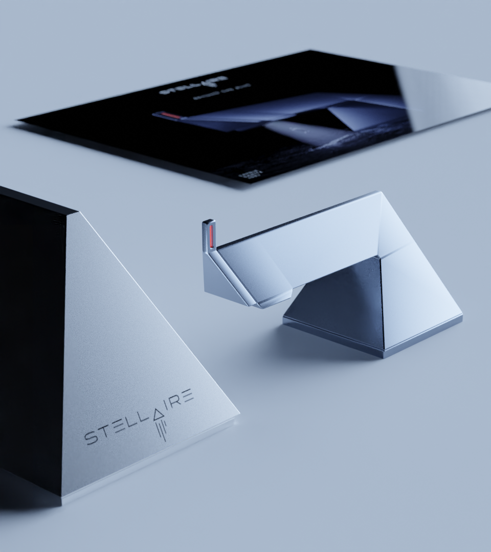
Poster Design
The poster was imagined as a launch visual for Stellaire. It used a stark composition: the faucet placed dramatically on a reflective surface with deep shadows, a minimalist gradient background, and the logo centered with spacing that suggests confidence.
The idea was to elevate the faucet to an object of desire, like how a tech product or a luxury watch is advertised. Not a utility, but a statement.
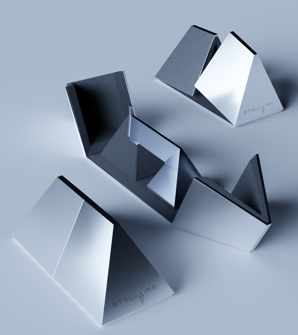
Packaging
The packaging design reflected the luxury + futuristic aesthetic. We used dark tones, foil finishes, and geometric paneling in the mockups. The unboxing experience was considered part of the brand story—one of unveiling a rare object.


CONCLUSION
Background Intent
The Stellaire branding project began with a single product: a faucet. But not just any faucet—this one had a striking, futuristic form that instantly stood out. At first glance, it felt like a fusion between a pyramid, the Louvre glass structure, and something almost alien—like a weapon from a sci-fi universe. It was sleek, minimal, and somehow ominous.
Our challenge was to build a brand identity from this form alone. The project was speculative in nature, meaning there was no real product brief—just the form as the foundation. The task was to extract meaning, create a narrative, and then build a complete visual identity system from that.
Form Analysis & Conceptual Theme
We began by studying the physical and emotional characteristics of the faucet. It was:
- Angular and faceted, like a prism or crystal
- Dominating and directional in its stance
- Shiny, cold, and industrial in materiality
- Abstract enough to feel like an object of mystery
We listed all the associations this triggered: pyramids, space probes, alien structures, futuristic buildings, sci-fi portals. We couldn’t decide on just one direction, so we combined them into a theme that felt rich and layered:
➡️ Space Prism — a fusion of cosmic mystique and geometric precision.
This became the core concept around which the brand would be built. The idea was to take the faucet out of the kitchen or bathroom context and instead reframe it as a luxury object born from future tech and interstellar design.
Naming & Strategy
With the theme in place, we began exploring names. We wanted something:
- Futuristic, but elegant
- Suggestive of light, reflection, or stars
- Easy to remember and say
After many iterations, we chose the name Stellaire.
- It’s derived from “stellar” (relating to stars) and “aire” (a French suffix suggesting elegance or essence).
- It evokes a premium, global, and slightly French-luxury feel—perfect for a high-end faucet brand.
From there, we built a brand strategy:
- Positioning: Futuristic luxury faucet brand for design-forward homes and hotels
- Tone of voice: Minimal, refined, poetic, and slightly mysterious
- Brand values: Innovation, elegance, geometry, purity
Logo & Tagline Development
The logo was inspired by the faucet’s angular geometry. We avoided any literal water imagery and instead used sharp, crystalline lines to convey form and structure. The typography was kept clean and spaced, allowing it to feel airy and high-end.
The tagline was created to anchor the theme of mystery and innovation. Some directions we explored included:
- Form. Flow. Future.
- Elegance Engineered.
- Where Geometry Meets Utility.
- Designed Beyond Earth.
We eventually settled on a line that reflects both minimalism and aspiration, fitting the "Space Prism" brand tone.
Poster Design
The poster was imagined as a launch visual for Stellaire. It used a stark composition: the faucet placed dramatically on a reflective surface with deep shadows, a minimalist gradient background, and the logo centered with spacing that suggests confidence.
The idea was to elevate the faucet to an object of desire, like how a tech product or a luxury watch is advertised. Not a utility, but a statement.
Packaging
The packaging design reflected the luxury + futuristic aesthetic. We used dark tones, foil finishes, and geometric paneling in the mockups. The unboxing experience was considered part of the brand story—one of unveiling a rare object.