

Miraee: Design System Redesign
Optimizing it for AI development process
Context
I led and redesigned the AI-native design system for Miraee to solve the component redundancy and code bloat caused by AI-assisted development. The new architecture gives iOS, Android and web one AI-compatible source of truth — cutting UI bugs, improving load times, and speeding up every feature that came after it.
Product
- iOS
- Android
- Web
Team
- Shashank Sharma (Product Manager)
- Harsha Arrimala (UI/UX Designer)
- Shubham, Raunak & Akhil (Full-stack Engineers)
- Mridula & PC (Cross-functional Leads)
Impact
- 35% faster page load times on web by purging duplicate styles and dead exports
- 2.5× speedup in UI dev cycles — screen building from days to hours
- ~60% drop in Jira tickets related to UI drift and visual bugs
- 95% elimination of leftover legacy artefacts on global updates
At a glance
The problem, and what changed
Rapid AI-assisted development exposed a flaw in our first design system: AI code generators could not reliably read it. The result was constant UI hallucination, duplicated components and severe code redundancy. Forcing the tools to reuse existing components removed the bloat, cut debugging time, and made a UI change land everywhere at once.
35%
Faster page loads on web, from purging duplicate styles and dead exports
2.5×
Faster UI dev cycles — screens in hours instead of days
~60%
Fewer Jira tickets for UI drift and visual bugs
95%
Of leftover legacy artefacts removed on global updates
Measured with the same audit script that produced the findings below, re-run at milestones against the same baseline.
01 — Context
Why AI-first development broke the frontend
Miraee, by Mondee, is an AI-native corporate travel platform for web, iOS and Android. It serves enterprise clients including JP Morgan, TCW, Infosys Global and HCS Global — travel coordinators, finance teams, HR, managers and employees.
To cut overhead and ship faster, Mondee went AI-first in development. But AI tools tend to regenerate a component rather than reuse one. Over time, near-duplicates of the same component piled up: more code to load, an app that broke more easily, and no reliable way to tell which version was current. Fixing that by hand would have cancelled out the speed we had gone AI-first to get. So the goal became a design system AI could read and reuse natively.
Reduce loading cost
Less duplicated code shipped to the client
Reduce latency
Faster loads across the app
Cut debugging time
One source of truth per component; fewer breakages to trace
02 — The audit
Where the generator was failing, line by line
I audited all three codebases to see exactly how AI generation was failing the product.
~4,250
Hardcoded colours across three apps
122
Card structs on iOS, against 7 shared components
74 / 78
Card pages on web with no empty state
39 / 52
Vendored web components never imported
57%
Of body text failing minimum contrast
10
Oranges in use; the brand orange ranked fifth
The same component, in many versions
- Android had no component layer at all — every screen defined its own buttons, cards and tables.
- iOS: 122 card structs; 7 shared components across 194 files, one of them an avatar for a single named person.
- Web: MCard in 48 files against 134 hand-rolled cards. MButton 105 vs 163. MInput 36 vs 64.
- The same near-black button fill shipped at four radii: rounded-full (25 files), xl (23), lg (21), md (9).
Hardcoded values instead of tokens
- ~4,250 hardcoded colours: 2,813 raw hex on web, 959 Color(hex:) on iOS, 484 Color(0x…) on Android.
- neutral-*: a second grey scale with 1,706 uses, in no documented palette. sage-*: an unofficial green, 268 uses across 54 files, standing in for status-success.
- #0F172B was the single most hardcoded value on both web and iOS — Figma-export residue nobody had tokenised.
- Ten oranges in use. The official brand orange ranked fifth with 6 uses; one undefined orange appeared 172 times.
Non-happy paths missing
- 74 of 78 card pages had no empty state. 39 of 85 pages had neither loading nor error.
- Zero dropdowns anywhere had loading, empty or error states.
- Tables: 3 of 34 sortable, 5 paginated, 2 with an empty state. Search: 3 of 23 with a no-results state. Charts: 1 of 17 with an empty state.
Dead code sitting next to live code
- 39 of 52 vendored web components were never imported — every generic primitive (button, input, card, table, select) was dead.
- Android's design-system folder held 13 files, all tokens and utilities. No Button, Card, TextField or Dialog.
- iOS bundled Urbanist and never referenced it. Web requested two fonts 72 and 179 times; neither loaded.
- Web's three most-imported UI files were not from the library: PageSkeleton (46), PageError (34), MetricStrip (26).
UI sized for demo data
- The median mock fixture had 6 items, across 51 arrays. Only 2 fixtures anywhere exceeded 50 items, both in chat.
- 87 hard caps in page code; the most common, .slice(0, 2), used 26 times. The Users page shipped 8 rows.
- At 508 rows: 34,281px of scroll (~40 screens) with the header static at −2,476px after one scroll. An 89-character company name stretched the table from 1,102px to 1,664px — nothing truncated.
Accessibility dropped in the hand-rolls
- The hand-rolled InfoTip used mouse enter and leave only — unreachable by keyboard or touch. The Radix tooltip it replaced opened on focus.
- 57% of body text failed minimum contrast, including the most-used text colour in the app.
Names that carried no meaning
- Two grey scales side by side (neutral-, stone-), neither marked official.
- The unofficial green beat status-success in five places: buttons, stepper dots, progress bars, banners, micro pills.
- A hand-rolled component read as clearly as the real one, so nothing signalled which to copy.
To add — The card wall
A grid of the 15 card variations found in the codebase, and the one fill at four radii — the two audit images that make the duplication visible at a glance.
03 — Insights
It builds screens, not systems
Read alongside industry research (DORA, GitClear), the audit resolved into three patterns in how a generator works — and four things that follow from them.
It builds what is on screen
It copies whatever is nearest
It builds against the data it was shown
- 01
The economics of reuse flipped
Generating a screen takes three hours. Building a shared component takes three hours. Reuse no longer pays back inside a sprint, so it loses every time. - 02
Verification debt
96% of developers do not fully trust AI code, but fewer than half review it. It looks beautifully formatted, so reviewers skim and miss the duplication. - 03
The isEmpty rule
Every page had loading and error states, because isLoading already existed in the code. Only 5% had empty states, because isEmpty did not. The system survives only where the code hands you the decision. - 04
It lands on design
Engineering is measured on speed; QA passes it because it renders. Design is left holding the drift months later, when it is obvious.
To add — Skeleton vs blank
Side-by-side of the 100%-implemented loading state and the 5%-implemented empty state — the image behind the isEmpty rule.
Where this is heading
The share of UI that is generated rather than drawn or hand-written is only going up. McKinsey's estimate of raw developer productivity by level of support makes the slope plain:
1×
Status quo — a proficient practitioner
1.2×
Capturable today — gen-AI tools in the loop
2×
Current frontier — agentic workflows
20×
Next frontier — supervising a digital agent factory
Raw productivity potential by level of developer support, multiple. Source: McKinsey & Company.
04 — Strategy
Stop fighting the cheapest path. Redesign what is on it.
People and models both take the cheapest path. Five moves put the right thing on it:
- 01
Notes for the AI, at the top of the codebase
A short Markdown file at the repo root: which components exist, which to reach for when, which states are mandatory. Plus a per-page note listing the components that page uses. The generator reads the system before it writes. - 02
A website the AI can scrape, instead of Figma
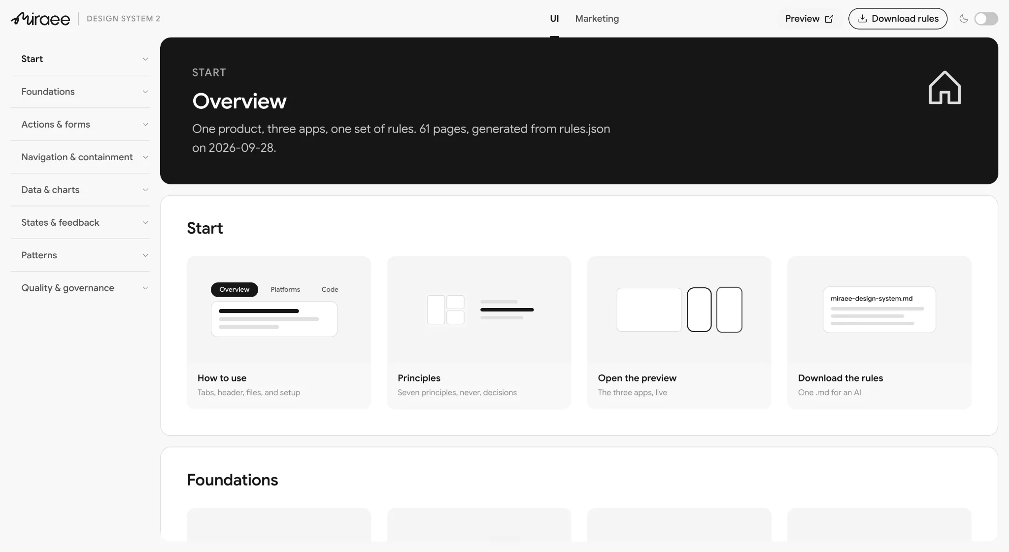
The reference site became the source of truth: 117 pages published as plain Markdown with an index at the root — 55 documenting what ships today across all three platforms, 62 specifying what replaces it. A Figma library assumes a human comes to look. Markdown in the repo is what the generator actually reads. - 03
Reduce what there is to process
One typeface. Fewer, higher-coverage components — one card with variants covering all four radii, not two cards and two hand-rolls. Tokens renamed into language a model can guess: status-success, not sage-400. Closed scales for spacing, radius and type, so there is no open range to interpolate into. - 04
Turn methodology into checklists
Markdown files developers and AI both follow: states required, tokens only, volume-tested at 500 rows before done. Procedure lives in files, not memory — so it survives deadlines, handoffs and generation speed. - 05
Make the right thing arrive on its own
Generalise the loading-state result: the data layer returns an emptiness signal the way it already returns isLoading, so an empty state becomes a variable you would have to deliberately ignore. Delete the 39 dead components — dead code copies exactly as well as live code. Seed every platform with something correct to copy: Android stayed the cleanest app with zero library, because it had iOS to copy line for line.
And measure rather than assert: the audit is a repeatable script, re-run at milestones, which is what turned adoption from a claim into a number.
Considered and rejected
Custom lint rules and CI gates
Visual regression testing
A Figma MCP server
Accessibility as a gate, not a feature
The test for the whole strategy: can a generator pull the right component faster than writing a new one?
05 — Who the system is for
Optimising for the largest user, which was a machine
A design system serves several audiences, and they pull against each other. Optimising for a designer browsing a library produces a different system from optimising for a generator retrieving a component. The order below is a decision, and it came from how UI was actually being produced at Miraee.
One designer covered three platforms. Engineers closed the gaps themselves, largely with AI generation. So most UI entering the product was neither drawn by a designer nor hand-written by an engineer — it was generated. The system's highest-volume consumer was a machine. Designing first for a human browsing a library would have meant optimising for the smallest user.
| # | Lens | Optimises for | The question it forces | What it costs |
|---|---|---|---|---|
| 1 | AI code generation | Correct retrieval without a human in the loop | Can a generator find and reuse this faster than writing a new one? | Fewer escape hatches; less per-screen tailoring |
| 2 | Engineering ergonomics | The lowest cost of doing the right thing | How many decisions before this renders correctly? | Opinionated defaults some teams will want to override |
| 3 | Brand distinctiveness | Recognisable with the logo removed | Which two or three elements carry the brand, and is everything else deliberately neutral? | Most of the system stays plain so the signature elements read |
| 4 | Decision quality | The user’s ability to compare and commit | Does this component help someone choose, or only display? | Components carry more responsibility than pure display would |
Accessibility sits underneath all four as a gate, not a lens: nothing ships that fails it. And the ordering deliberately deprioritises per-screen visual tailoring, designer-authored one-offs, and a Figma-first workflow where design leads and code follows. With one designer and three platforms, code is where the system has to live, and its artefacts have to be readable by whatever is generating the code.
06 — What I changed
Fewer things to remember, each doing more work
A generator — or a rushed developer — only reliably follows a limited amount of documentation at once. The more rules and variants it has to hold, the more it silently skips. So the fix was not "make things consistent"; it was to reduce how much the system needed to remember in order to stay consistent. Fewer typefaces, fewer components, fewer rules. That is the direct reason for collapsing to one typeface, and for building variants of one card instead of maintaining several near-identical ones.
| Intervention | Failure mode it closes | Lens | What enforces it | Cost |
|---|---|---|---|---|
| One typeface | Two fonts requested, neither loading; ambiguous selection at generation time | 1, 3 | A single font token; no alternate to reference | Hierarchy carried by size, weight and space only |
| Semantic token names | A generator reading #FF5733 mimics the pixel; one reading color-brand-primary reuses the source | 1 | Checklist: tokens only, no raw hex; audit counts stragglers at each milestone | Naming discipline in legacy code too |
| Consistent naming grammar | Names that cannot be derived have to be looked up, and lookups get skipped | 1, 2 | Review checklist; naming is mechanical, so violations are visible | Some existing names had to change |
| Closed value scales | Open ranges invite invented values | 1, 2 | Type constraints — an off-scale value fails to compile | Edge-case layouts solved by composition |
| Deleted unused components | Dead code competes with live code during retrieval | 1, 2 | Dead exports removed; the audit re-checks at milestones | Loss of some speculative components |
| Fewer, higher-coverage components | The correct component is easier to identify | 1, 2 | The audit reports one-off counts at each milestone | Some screens lose a custom-fit component |
| Required states on every component | Loading, empty and error were being skipped silently | 2, 4 | A component does not type-check without them | More work per component up front |
| Docs colocated with code | Generators and engineers read the codebase, not a doc tool | 1, 2 | Docs live in the component file | Upkeep moves with the code |
| Contrast gate on every colour | 57% of body text failed | Gate | Checked in review before a colour is added | Some preferred colours were unusable |
| One rule for what opens where | Inline, popover, panel, sheet, dialog and page chosen inconsistently | 2, 4 | A single documented decision table | Fewer per-screen interaction choices |
What I kept despite the cleanup
What I reversed
What I did not build
To add — Before and after of one component
The card is the natural candidate: two cards and two hand-rolls collapsed into one component with variants. One image, old beside new.
07 — Result
What the system now guarantees
- One typeface, one accent colour, one grey scale. Every colour must pass contrast before it is added.
- Every component must define loading, empty and error states before it ships.
- One rule for what opens where: inline, popover, panel, sheet, dialog, new page.
- Written for a machine to parse: short rules, no exceptions buried in prose.
- Adoption is tracked, so it cannot silently drift again.
08 — Reflection
What I would do differently
- Track adoption from day one, not after the fact.
- Test with real data volumes earlier — most lists were designed against six sample items.
- Decide how the system stays maintained before designing it. Manual token syncing is what caused the drift the first time.
To add — Before-and-after table
Design-inconsistency QA tickets (8 weeks before and after), AI context cost per generated screen, design-handoff-to-merged-PR time, and components built per sprint — the rows the headline numbers should be traceable to.